CHOCOLATE
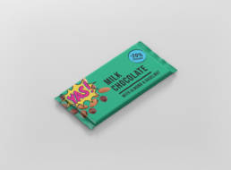
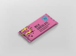
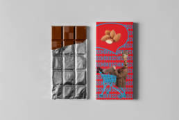
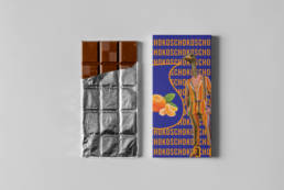
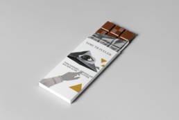
Different design targets different customers. We were asked to provide designs for three different price groups: Discounter, medium and luxury range. For the discounter version I did a quick design, going for bright colours to give it a touch of pop art. For the medium version I went for a rather loud design as well, giving it a bit more of a funky weird touch, and hoping that it would draw attention in a supermarket. For the luxury version, I used a serif font paired with a collage style, sticking to elegant black and white design, accentuated only by a symmetric symbol embossed in gold.
YEAR2020BRIEFPackaging design, concept
Share

